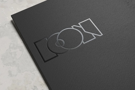
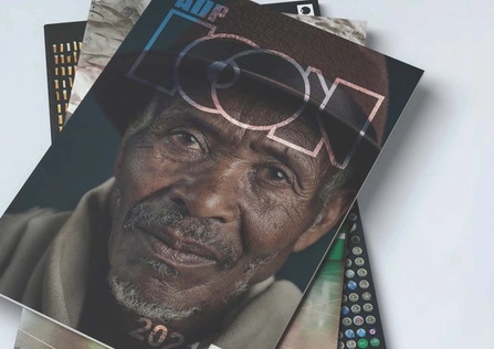
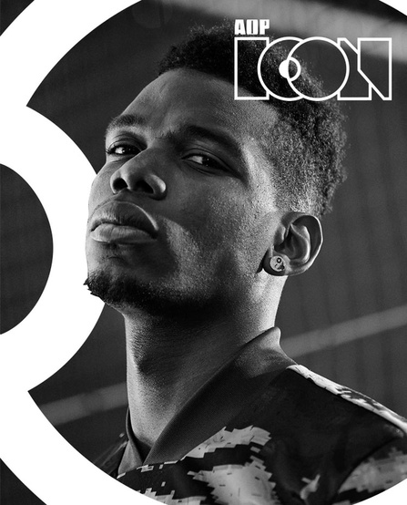
AOP ICON
Creating an ICON for award winners.

The Association of Photographers approached NOSY with an interesting task: developing visual branding for a new type of membership reserved for the very best working in the field of visual communication.

Challenge
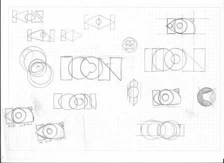
Working with an established association like the AOP, which had more than 50 years of heritage, we decided to create something that complemented the existing branding while moving forward with a more contemporary look and feel.
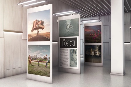
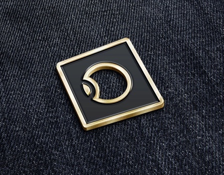
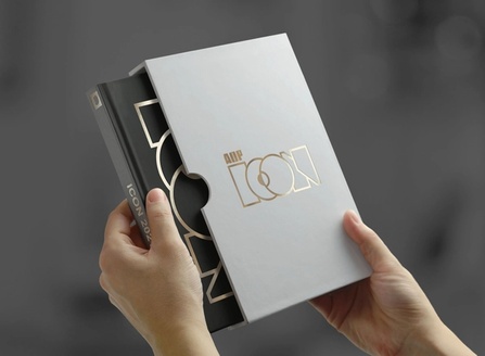
We also needed to create a logo that would translate into being used as a physical award, as well as reproducing on posters, books, and exhibitions. The final design was perfectly received by the stakeholders at the AOP, who signed off on the designs and branding guidelines on the second round of iterations.
We look forward to the AOP ICON becoming an annual fixture in the AOP Awards season.


The Icon branding is exactly what we were wanting, it is clean, crisp and contemporary.
- David Harrigan, Creative Director