Creating a brand and platform for a complex energy venture
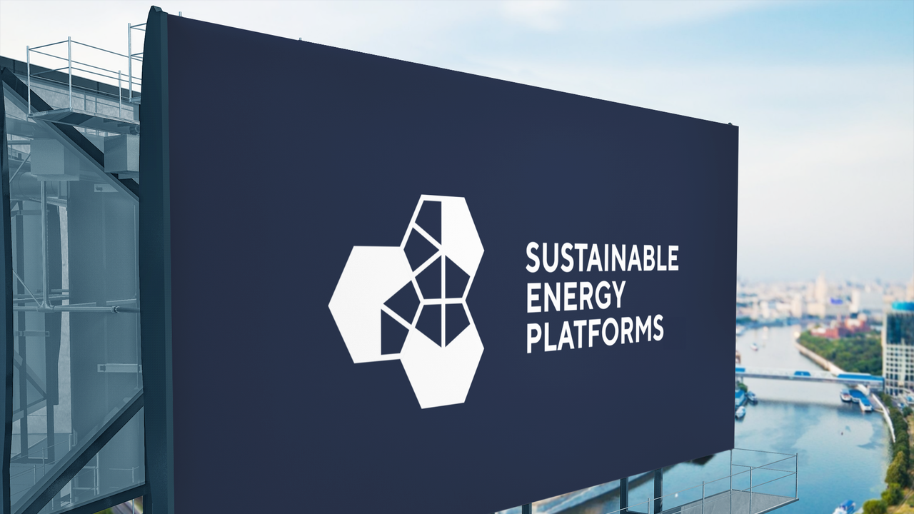
CASE STUDY - Sustainable Energy Platforms

Sector
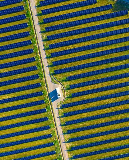
- Energy
Services
- Brand identity
- Digital platform design
- Marketing campaign
Building a brand and digital platform from the ground up, aligning stakeholders and shaping a clear identity as the business took form.
Key outcome
Delivered a complete brand and digital platform at launch, providing a system that supports consistent communication as the business grows.

01 - THE CHALLENGE
Sustainable Energy Platforms (SEP) was a new B2B venture with no existing brand, operating within a complex and evolving space.
The proposition was still being defined, with multiple stakeholders shaping direction in parallel. This created a moving target, where messaging, structure and requirements were developing alongside the work.
The brand needed to establish credibility with a commercial audience while avoiding the visual language typically associated with sustainability.


02 - THE APPROACH
The work developed alongside the business itself.
Rather than waiting for a fixed brief, the identity was shaped in parallel with the evolving proposition, working closely with senior stakeholders to maintain alignment as decisions were made.
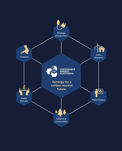
The system was built to reflect the nature of the platform. Flexible, non-standard and designed to adapt to different contexts. This thinking informed both the identity and the wider visual language.
From the outset, the focus was on creating something that could be used, not just launched. The structure, assets and tools were designed to support the internal team as the business continued to develop.

03 - THE OUTPUT
A complete brand and digital system designed for clarity and scale.
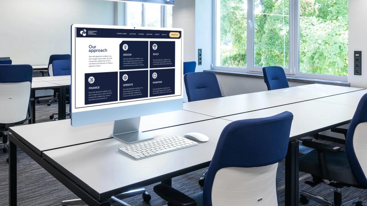
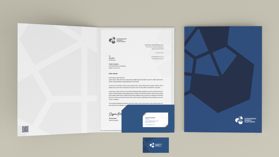
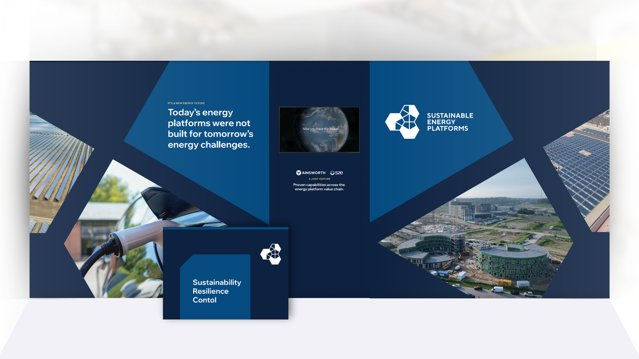
The identity was applied across key launch touchpoints, including the website, presentations, exhibition materials and digital content.
Supporting this was a structured set of guidelines, templates and assets, enabling the brand to be used consistently across different teams and environments.
Everything was built to work across digital, print and physical applications from day one.


04 - THE RESULT
SEP launched with a clear and credible identity, aligned with its audience and distinct within the sector.
The brand provides a stable foundation as the business continues to evolve, allowing new outputs to be created without losing consistency.
What began as a complex, multi-stakeholder process resulted in a system that brings clarity to how the business presents itself.


Tell us about your project
Share a bit about what you’re working on, your goals and any challenges you’re facing. We’ll review it and come back with a clear next step.